Graphic designer Gabriel Fagundes has masterfully crafted a minimalist brand identity for Hype, an esteemed architecture firm based in Porto Alegre, Brazil.
Reflecting Architectural Foundations
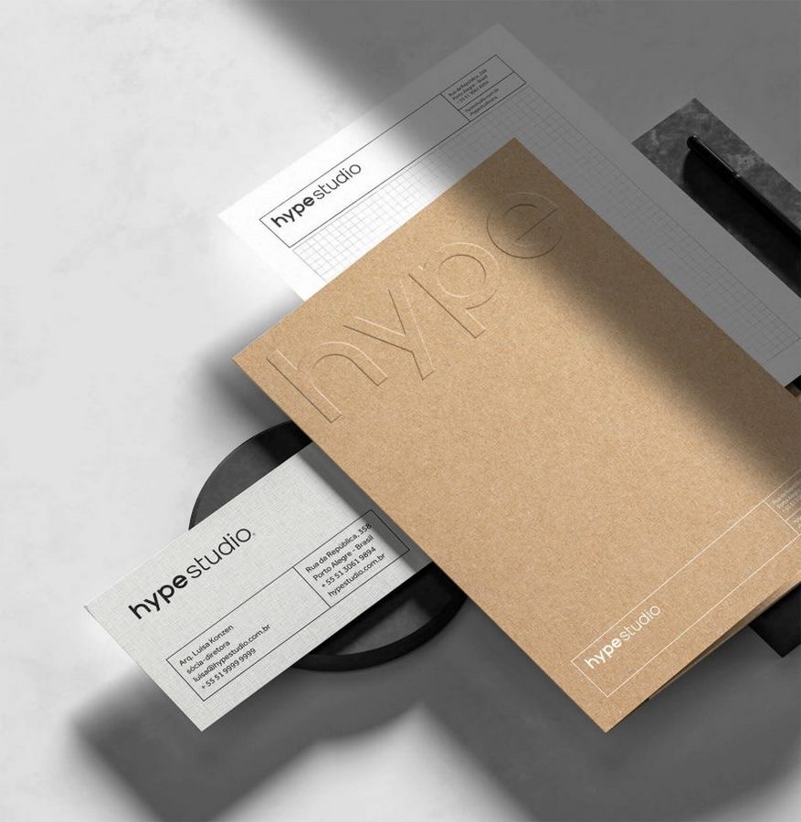
The visual identity devised by Fagundes seamlessly integrates grids and outlines, paying homage to the foundational elements inherent in architectural plans and projects. Through meticulous attention to detail, the brand’s identity captures the essence of precision and structure synonymous with architectural design.

A Refined Aesthetic
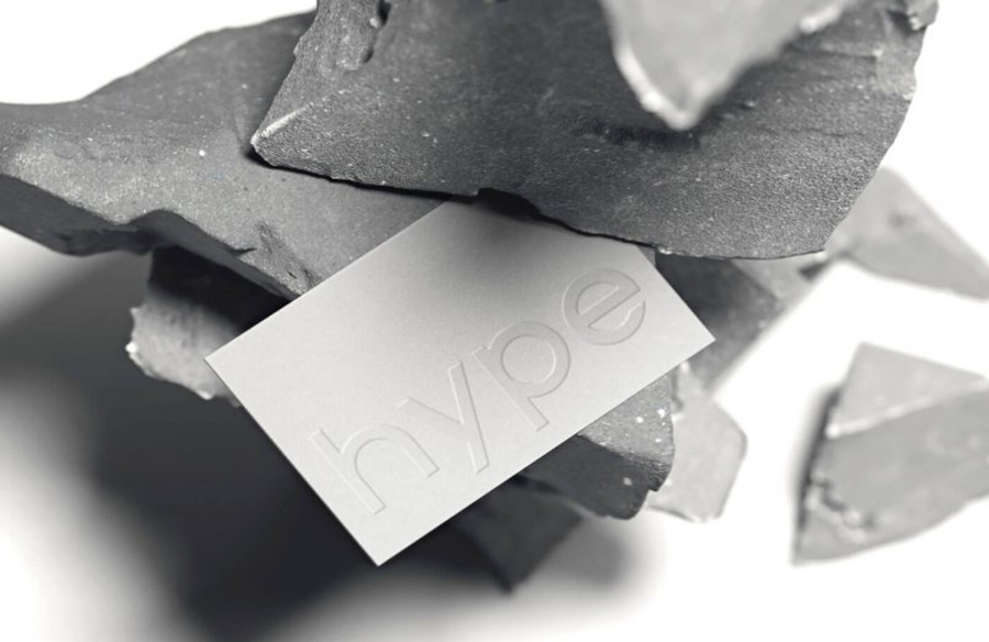
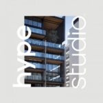
At the heart of the brand identity lies a custom typographic logo, complemented by a sophisticated black and white color scheme. This deliberate choice imbues the brand with an air of refinement and elegance, echoing the studio’s commitment to quality and excellence.
Inspired by Fibonacci
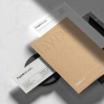
Fagundes drew inspiration from the Fibonacci sequence, a mathematical concept often utilized in architectural endeavors undertaken by the studio. The utilization of Fibonacci in constructing grids lends a harmonious balance to the visual language, as showcased in the meticulously crafted pieces such as folders and business cards.
Elevating with High Relief
To add depth and sophistication to select pieces, Fagundes incorporated high relief techniques. This artistic flourish brings a sense of volume and elegance to the brand’s collateral, elevating the overall aesthetic and leaving a lasting impression on viewers.
Gabriel Fagundes’ branding for Hype Studio is not merely a visual identity; it’s a testament to the studio’s dedication to excellence and innovation in the field of architecture. With its minimalist yet refined aesthetic, the brand stands as a beacon of sophistication in the architectural landscape of Porto Alegre.


