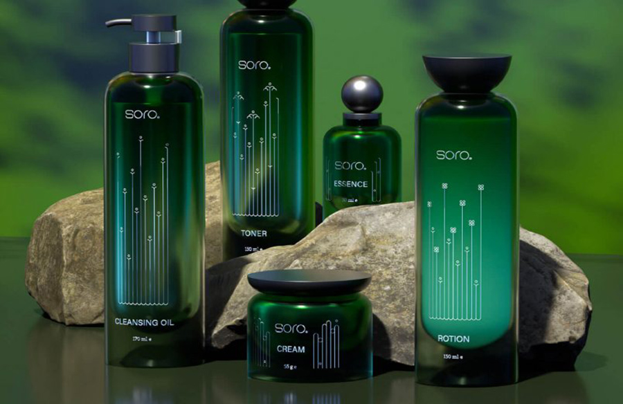
Jiwon Chu, a talented designer from South Korea, showcases her minimalist approach in the branding and packaging design for Soro, a line of hypoallergenic cosmetics.
A Holistic Skincare Experience
Soro stands out in the cosmetic industry for its holistic approach to skincare. With a focus on naturally derived ingredients extracted from plants, the brand aims to minimize skin irritation while providing effective skincare solutions. Jiwon’s design for Soro reflects this ethos by embracing simplicity and natural elements.
Minimalism with Impact
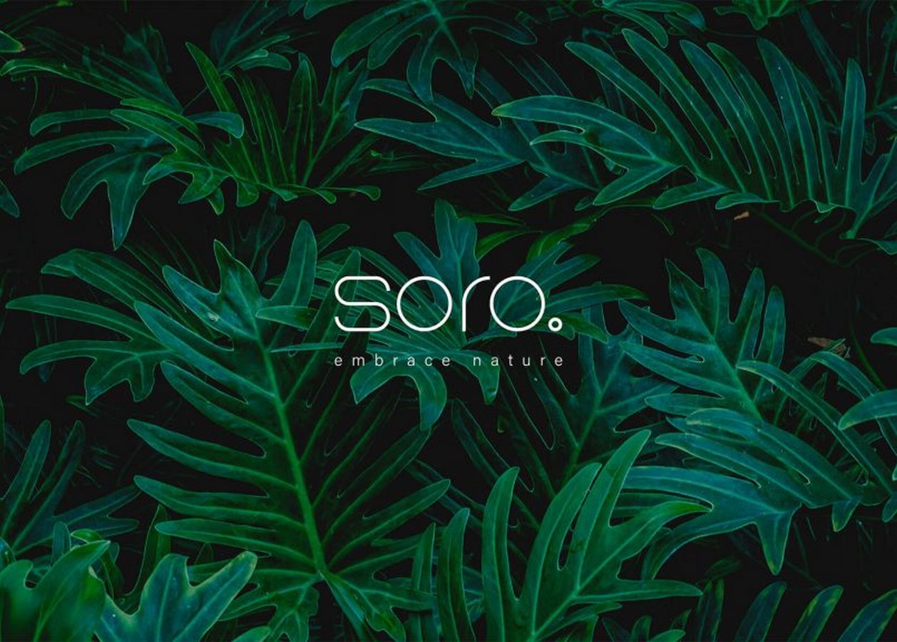
The branding and packaging design for Soro exudes a sense of minimalism and sophistication. By employing a minimalist aesthetic, Jiwon captures the essence of Soro’s commitment to simplicity and purity. The choice of a green color palette evokes feelings of freshness and vitality, reinforcing the brand’s emphasis on natural ingredients and gentle skincare.
Elegant Typography and Subtle Illustrations
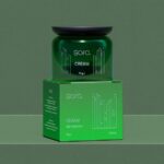
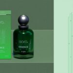
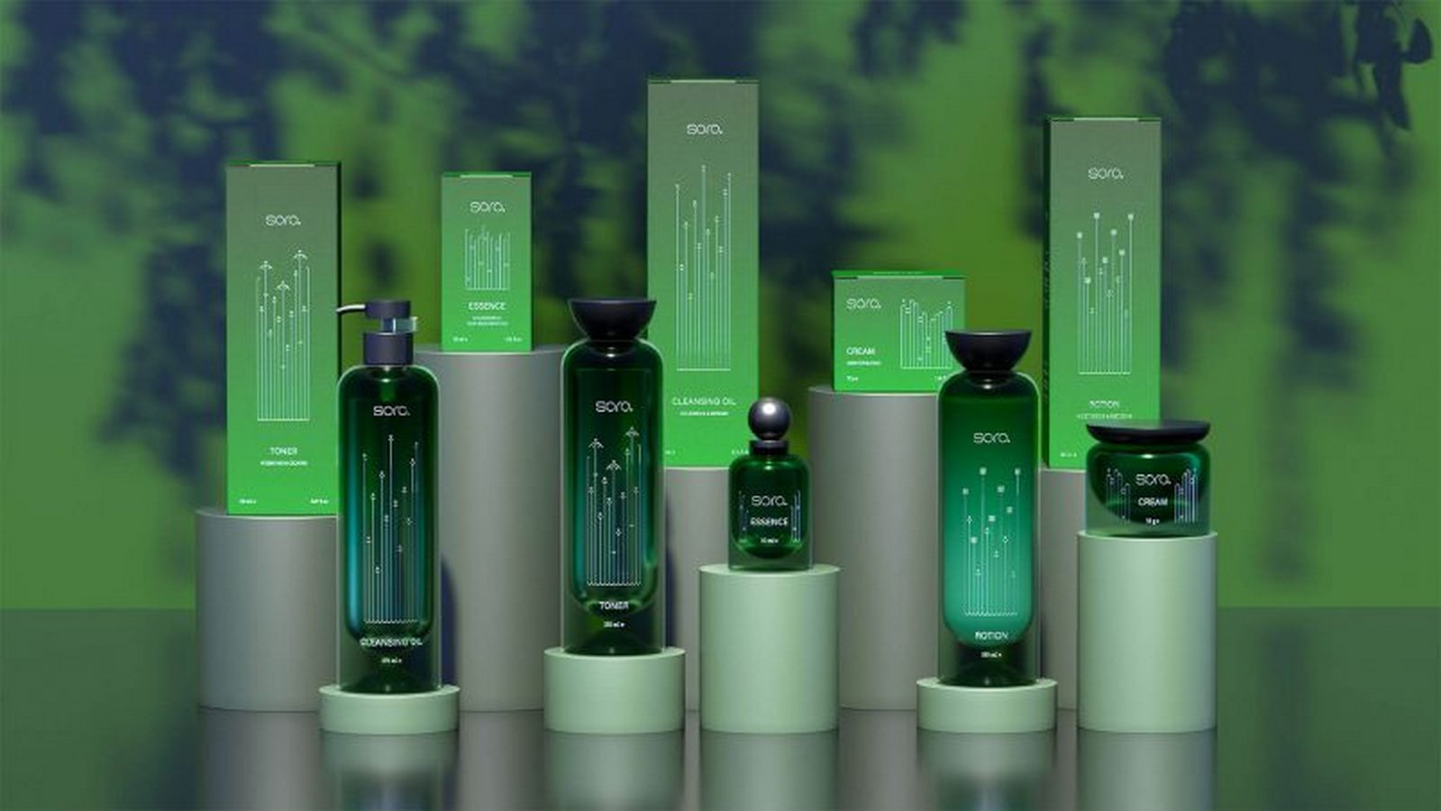
The typography chosen for Soro’s branding exudes elegance and refinement, further enhancing the brand’s image of sophistication. Combined with simple geometric illustrations, the packaging design subtly hints at the natural ingredients used in Soro’s products. These illustrations not only add visual interest but also communicate the brand’s core values of transparency and authenticity.
Jiwon Chu’s minimalist branding and packaging design for Soro perfectly encapsulate the brand’s philosophy of gentle skincare with natural ingredients. With its clean aesthetic and thoughtful details, the design sets Soro apart in the competitive cosmetics market, appealing to consumers who prioritize simplicity and effectiveness in their skincare routine.


